

Monday
PlayMatic graphic
I designed this cool, retro feeling logo for arcade game system: PLAYMATIC! It was soooooo much fun. I used a pencil to sketch ideas, then made the final using Adobe Illustrator.
#graphicdesign #logos

Ink and Watercolor Painting
I love using waterproof ink pens in various pen tip sizes and going back after to add watercolor washes. This is painted on 140lb watercolor, an old building in Vermont.
#inkandwatercolor #originalart


Watercolor Floral
I painted this using watercolor, on 140lb paper. Approx 12" by 9". For sale. $95.00 OBO. I love the pastel colors in the background and on the vase.
#watercolor #originalartwork Enjoy. 

Graphic for Adams Family with Design of TODAY
This was one fun project. Graphic created for a styleguide for the movie Adams Family. I worked for www.designoftoday.com for this project, which is why I can show this for portfolio purposes.
#graphicdesign #illustration


Liambru Ale Company: Logos, labels, and graphics
Liambru Ale Company is a Vermont Ale Company and they are AWESOME. I rearranged, updated, laid out some of their beer labels. I also created a business logo and tshirt graphic for them. Find out more about them here: www.liambru.com/
#graphicdesign #logos #graphics #illustration
Happy. :)


New Batch of Watercolor Paintings
THESE ARE FOR SALE Y'ALL. I am committed to working within budgets. Make me an offer. Seriously. I'm a responsible, nice person. Buy art, be happpy. :) #watercolor #artforsale #fineart 


Tuesday
Jurassic Jumble Game
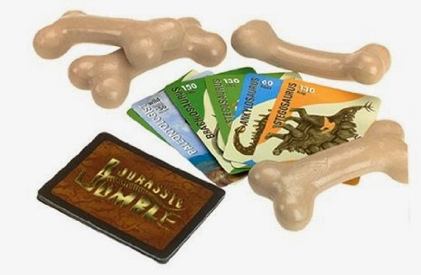

I illustrated all of the dinosaurs for the game Jurassi Jumble. The illustrations started as watercolor paintings and then additional details and finessing were added using Photoshop. It was a nice learning experience getting to know more about some of the fascinating creatures that roamed Earth so long ago.
Mattel Barbie and the Pink Shoes


I.C. Pup

Friday
Big Bang Theory t-shirt design

We, my co-workers and I at Design of Today, worked on creating a style guide for Warner Brothers based on the tv show The Big Bang Theory. Boy, am I a fan. What a great show and fun project. Today, I found one of my designs for sale on a t-shirt! I always get so excited when this happens. Here's a link if you'd like one of these gems for your very own.
Monday
Small Robot

I created this little guy as part of a co-workers birthday card. He was a lot of fun to make and was received very well. Had to share.
Friday
Happy Halloween, last two.

A little axe never hurt anyone, right? Also, I enjoy gargoyles year round; so, here's to a happy Halloween and every day after.

Wednesday

Saturday
Halloween 2

Costume idea: be a chicken person. Throw candy on the ground occasionally and peck at it.
Tuesday

Thursday

Wednesday
Drawings from Ice Age 3
 At Design of Today, where I work as an illustrator and graphic designer, we did a project for Twentieth Century Fox for the movie Ice Age 3. I created a very simple "baby" version of all the main characters. It was so incredibly fun. These little guys are definitely some of my very favorite creations.
Monday
Website illustrated by me
 For the past 7-8 months I have been creating illustrations at work (Design of Today) for a company called Nutritionally For You owned and created by a wonderful woman named Chris Sare. It has been such a fun project. Chris emailed me over the weekend to let me know that the site is now live. I am so excited. Seeing my illustrations come to life is just so so fantastic. Please CLICK THIS to explore the site. I am including screen shots of a few pages, be sure to go see the rest.

FOUND: one little pattern

I found this little pattern on my computer, I made it last year sometime. It's cute.
Sometimes, design CAN be cute. I swear.
Upcoming Show Announcement
I am excited to announce an upcoming watercolor show
and would love to see you there!
and would love to see you there!

Tuesday

Wednesday

Monday
Cheetos with toe nails

My husband has a friend who opened a snack size bag of Cheetos recently only to find a large toe nail piece in with the orange puffs. GROSS! Understandingly enough, he threw up and hasn't been able to eat Cheetos since, me either! Since today has been quite discouraging so far, I decided to make this mock Cheetos bag. Hopefully it will make my hubby and his buddy laugh.
Tuesday
Newly completed pattern and seahorse

This is a pattern that I just finished for a well known shoe company. They also have a great line of clothing. It wasn't chosen, but I really like it, I think it's fun to look at because there is more happening than first meets the eye. I took the name of the company out because this is an ongoing project. However, since this one is out, I don't think there is any harm in showing it.

Also, this seahorse was submitted as an idea for a t-shirt design several years ago. I just found it cleaning out some folders on my desktop and really think it's fun, so here it is as well.

Dark City Underground blog header

I designed a blog header for Dark City Underground. DCU is a fantastic blog that features book reviews, movie trailers and reviews, and much more. It is very eclectic, well written and fun. I wanted to create an image that showed what a variety of posts DCU showcases, hence, the cowboy, scary dude, and PI. I also wanted it to be somewhat stark and have a lot of white as the background at DCU is white. I used the font courier, a font I don't normally use, and it worked well in this case. I love how it looks like an old typewriter. Perfect for a blog primarily about books. I love how this turned out. CLICK THIS to see the header image in action and explore DCU.
Would you like me to design a header for your blog or website? Email me for details.
Look, another one!

I love making these. Designing anything really, is a blast. It's such a rush when things go well. I know, I'm a geek, I've never said otherwise. Once again, pertinent info has been blurred. The bride in this case wanted something fairly different from the invite I put up here a week or so ago, very different feel and colors. I love how it turned out.
Want me to design yours? I'd LOVE to. Email me for info.
Wednesday
Wedding announcement fun

Something new and different, I designed a wedding announcement. It was really fun. The couple told me they like gerber daisies, simple design and fall colors. I wanted (yes, I did add my input) it to have a classic feel and look sophisticated. Zowie what an awesome challenge. This is what I came up with. They loved it, me too. Ahhh YES! That's they way I like projects to go! (Pertinent info has been blurred and dulled to protect the innocent.)
Monday
Bamboo Brace by Professional Therapies

Recently I created a series of illustrations for a company called Professional Therapies. They have designed an arm brace for children called The Bamboo Brace, to read more about it CLICK THIS. The illustrations I created will come with the brace and help an adult fit a child with the brace. They were really fun to draw. I love the baby's chubby little arm.
Sunday
Ed Hardy

Worked with the fine folks at Design of Today coming up with some tee shirt design ideas for Ed Hardy. Liked this one a lot, skulls with heart shaped eyes always work for me.
Tuesday
New logos


I just finished a couple of projects creating original branding logos. One was for a company called Strategic Outdoor Shop and the other for a very creative woman named Christina Stover.
Monday
Clean with a bit of grunge

Recently I was asked to create a logo for a photographer named Noelle Reynolds. The tricky part was that she wanted her logo to be clean, as she shoots quite a few bridal pictures, yet have a grunge/messy feel. I was instantly intrigued. How exciting to come up with a logo that would combine two such opposing ideas. This is what I came up with. The cool thing is that it works alone or on a colored background.
Subscribe to:
Posts (Atom)